So, I've been a bit 'elsewhere' of late.
Had a few Life issues to deal with including the second brand new PC to blow up on me in two months (the first one lasted 3 hours, the second one 2 months and 3 hours--such quality!).
It seems the Universe has been trying to tell me something about the crappy Lenovo All-in-One I bought (highly do NOT recommend this machine), and instead wants me to have the custom-made, multi-screen Starship Enterprise flightdeck I really, truly need on this illustration journey (but cannot afford--I shall be planting a money tree in the morning).
While waiting to sort my computer issues, I've decided that tearing my hair out is not an option--it kind of hurts--so I've been catching up on other bits and pieces, like tidying loose ends, housekeeping and accounts and tax returns and acquittals and such. Yay. Creativity powering!
I've also been in talks about the possibility of illustrating a new book, and this got me to thinking about illustration styles.
I would want to use full digital artwork for this book. I did varying character samples and my publisher liked one in particular (the character is VERY cute) and yet I felt this character just wasn't the right 'fit' for the illustration style I envisaged.
I spent a few computerless days in deep thought about life, the universe, computers that self-implode twice in two months, which species of money tree grow the fastest, and about how I could adjust this character style to 'fit' with the rest of the book. But no amount of pondering helped. The fit just wasn't happening... and more than that, I just wasn't feeling the love. I think a big part of a seamless book creation journey is loving and enjoying it and feeling inspired to create in a way that resonates with you at the time.
My publisher is wonderful and she completely understood my ponderings, so I'll be shortly drafting up a scene that combines the changes we talked about (as soon as I get my Enterprise workstation that I'll pay for with buttons and matchsticks).
One of the changes I want to make to the character style is to have the whites of eyes, as opposed to dots. I ADORE dots. Anna Walker is the master of dot eyes. Ditto Bob Graham and Stephen Michael King--all masterful, with gorgeous, expressive characters. They are whimsical, sweet and oh so warm.
 |
| Anna Walker |
 |
| Bob Graham |
 |
| Stephen Michael King |
But for this book, the look will be very modern and there will be no outlines on any of the characters or other components--and on top of that, I am not yet a master of eyes. I'm learning fast but I know my strengths, and eyes with the whites makes it a lot easier (for me, anyway!) to emote. And oh, how I love to emote.
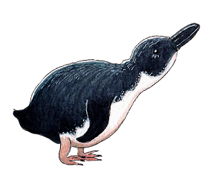
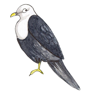
Have a look at the boy at the top of this post and some animals (below) from my upcoming book, Australia Illustrated (November). You can see the 'character' and quirk white eyes bring. Of course, if the book I was creating wasn't super modern and fully digital and driven by characterisation, then dot eyes would work beautifully. There's no right or wrong.
I guess what I'm trying to say is that each book has its 'look' and its own style, and so many elements come together to create that style. What works for one book doesn't work for another, and that can extend to the medium used, the colour palette, the layout, the design and most especially the story. Is the story whimsical, imaginative, narrative, active, passive? What style best suits the themes and narrative type?
I sometimes see picture books where the narrative doesn't marry well with the imagery. It's not that the illustrator has failed to interpret the text. It's just that the style they've used doesn't marry visually.
Colour palette is HUGE when it comes to this kind of interpretation, as is the medium used. For example, watercolours in pastel colours marry well with sentimental storylines, and sharp, computer-generated imagery with quirky characters marry well with high-action picture books, movement and drama. Fairytales and fables marry well with high-detail and decorative elements. Humorous, dry tales marry well with simplistic imagery with either scant or zero background.
There is, of course, always exceptions, but understanding styles when illustrating text is vital, from the way characters will look (as I'm in the middle of doing) all the way through to your target readership.
Whatever book you're producing or plan to produce, it's also vital that you work in a style that makes your heart sing at the time. We do our best work when we either write or draw in a style we currently resonate with. For me, that changes all the time--and I'm grateful for that because it makes things so much fun.
Prediction: I bet my next book after this one will have dot eyes!
And to finish off, some birds that appear in Australia Illustrated, complete with their character-generating 'white' eyes.
(Footnote: donations of buttons and matchsticks happily accepted. Email me for sewing-box deposit details.)


4 comments:
Fascinating post, Tania! :) Speaking as an artist who doesn't draw human eyes or figures et al, I found this really interesting. Maybe one day I will take that leap like you ... just joking, I think I'll just enjoy yours. ♥
Love the eyes! So much expression!
Interesting post Tania - now I feel I need to check out 'eyes' in all the picture book son my shelf and see how they work or don't work - thanks for sharing your knowledge.
Thanks Tania - I found this really interesting. Love your artwork - and the eyes!
Post a Comment